Goo Goo Eyes
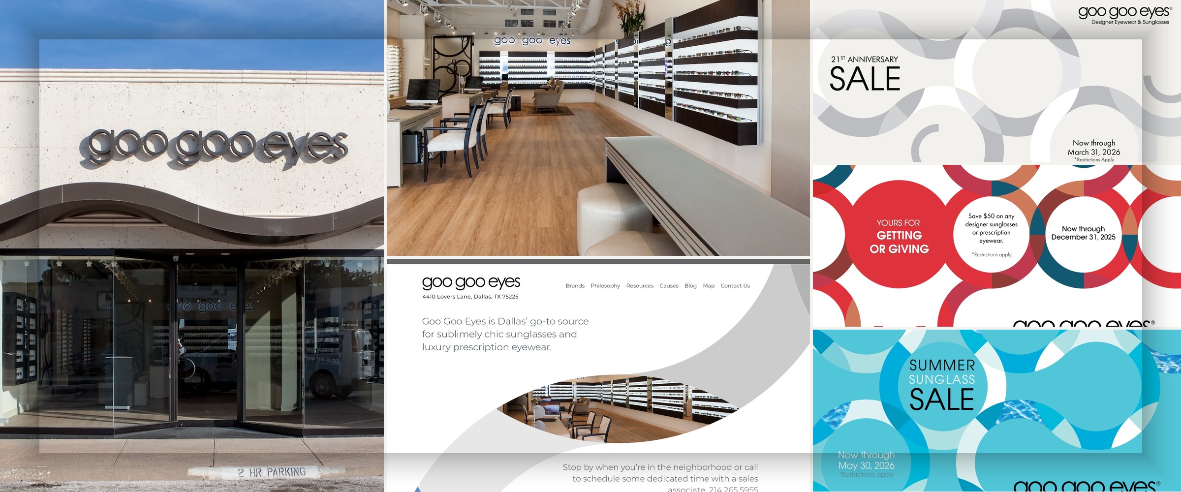
Goo Goo Eyes is a luxury eyewear retailer in Dallas with a distinctly different proposition from the utilitarian core of the broader Ready Reading Glasses business.[page:1][page:2] Where ReadingGlasses.com earns trust through clarity and speed, Goo Goo Eyes earns it through curation, atmosphere, and a more fashion-aware point of view.
The work here was about translating that upscale, low-stress in-store experience into digital form—so the site felt premium and editorial without becoming vague, overly precious, or harder to shop.[page:1][page:2]
Founded in University Park in 2005, Goo Goo Eyes positions itself around unique designer frames, attentive personal service, and a refreshingly consumer-centric shopping experience.[page:1][page:2] The brand also emphasizes a visually quiet retail environment and digital fitting technology, which means customer confidence depends as much on trust and expertise as it does on style.[page:2]
That context shaped the digital work. The site and campaigns had to support premium perception, but also reduce friction, reinforce service, and help customers feel guided rather than intimidated.[page:1][page:2]
Create a digital and campaign identity that feels elevated without feeling inaccessible, and that can sit credibly next to premium fashion brands while operating on a much leaner internal structure. The challenge was not simply to make the brand look better, but to make luxury feel approachable enough to shop.
Visual Point of View
The overall visual identity—including the look and feel of the website, print, and email campaigns—was established by Saputo Design in 2020. My role has been to implement that system, steward it across touchpoints, and evolve it through ongoing day-to-day execution so the brand stays coherent as the work scales.
Promotional creative leads with editorial photography and a more fashion-adjacent tone than the parent business, while the shopping experience remains direct once a customer chooses to browse. That balance is what keeps the brand feeling elevated without becoming performative.
UX & Ecommerce Architecture
I own the usability and UX/UI across the full experience—navigation, product communication, page structure, and the logic that makes the editorial treatment feel effortless rather than slow. The goal is a shopping experience that earns trust through taste without ever making it harder to buy.
Brand Architecture
Maintaining a distinct brand presence within a shared portfolio required explicit decisions about where to share infrastructure and where to diverge. Visual language, photography direction, and copy tone were brand-specific; payment, fulfillment, and core ecommerce systems were shared. The line between those two was deliberate.
Campaign Consistency
Because the brand lives across web, Instagram, and email, every campaign touchpoint needed to reinforce the same tone: calm, premium, curated, and confident. My role was to make sure those expressions stayed aligned even without a large dedicated creative team.
- A distinct luxury brand presence within a shared ecommerce portfolio—strong enough to feel independent while still benefiting from shared operational infrastructure.
- A more cohesive relationship between brand storytelling and ecommerce usability, so the site feels premium without sacrificing clarity.
- Editorial photography and campaign direction that differentiate Goo Goo Eyes visually from both the parent business and more generic eyewear competitors.
- Sustained consistency across site, Instagram, and email through ongoing stewardship rather than one-off campaign bursts.